A contact page is essential and one of the most critical elements on websites, regardless of your website type. When you are first building your website this is one of those you prioritize first to complete the basics of your website. But what does the contact page really contribute to the growth of your website?
Contact Page is static content on your website that has all the contact information of your business. This is where your potential customers can see the details on how to reach out to you, send their concerns, book meetings and etc.
Continue reading to see more about contact pages, the elements of contact pages, and how to make one that will help you grow your business!
What is a Contact Page?
Often times website business owners mishandle this page. Some just put a number in it, some are just a form and it’s done. They just give an email address, phone number, and physical location and consider it their contact page. A contact page is a page on your website that allows your potential clients to contact your business and reach out to you.
That being said, contact pages are more than just forms that prospects or customers need to fill up on your website. It is what builds the connection between your business and your prospects.
POTENTIAL CUSTOMERS —CONTACT US PAGE—> YOUR BUSINESS
Contact Page when taken seriously and build right can be a powerful tool for your business! A contact page must make it easy for customers to reach you.
Elements of a Contact Page
These elements are the ones that are generically found on the contact page on websites. This is everything your contact us page needs to have. It does not need to include a lot of unnecessary elements. This is to divert their attention directly to the call-to-action button and to make sure that there are no distractions for them.
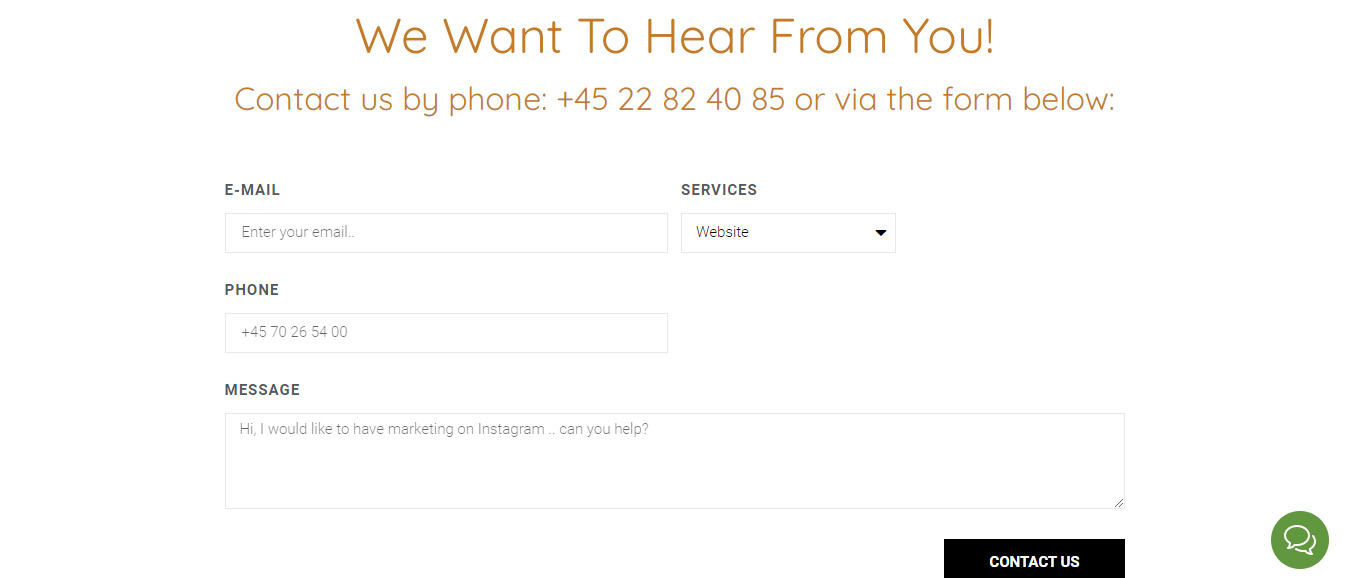
- Contact Form
- E-mail Address
- Phone Number
- Location
- A relevant photo (optional) depending on your industry or business
- A convenient way to “Schedule a meeting”
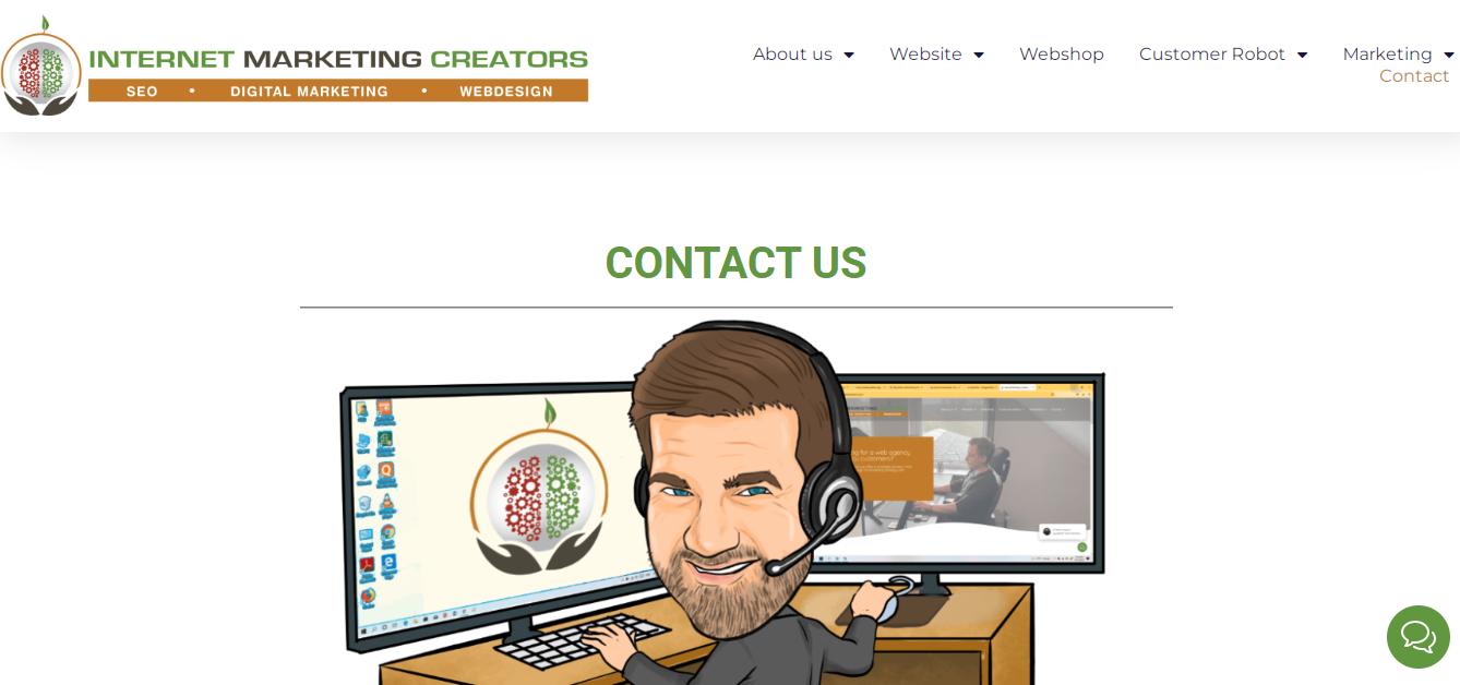
Below is an example of a contact page from Internet Marketing Creators. See the elements below!

SCROLL DOWN AND SEE

How to Make a Great Contact Page for your Website!
To be able to make a great contact page, here are the following things you must keep in mind:
1. Make it Easy for the Visitors to Access the Contact Page
Ensure that as you make your contact page, you put it in a place where it is accessible to your traffic regardless of where they are on the website. So the best thing to do this is to put the Contact page on the menu at the header of the website. This is so that when the prospects made up their mind, they can reach out to you as fast as possible before their minds change.
2. Do not put Unnecessary Elements (but)
No one wants to see too many elements bombarding the contact page, because if anything, this must be the simplest page of all. But even so, you still have to work on it. Keeping it simple doesn’t mean you should just let it look like you just gathered your information and a form and just dumped it on the page.
Try your best to make it look minimalist, still aligned to the overall theme of your website and business, and include ALL the required elements above.
BUT one thing to keep in mind is to not be scared to make sure that your contact page looks somewhat fun and not dull. But you have to assess the intensity of the “fun” that you will incorporate. Do not be afraid to try and make your website appear fun and physically appealing still, but be careful not to overdo it!
3. Assure the Responsiveness of the page
This is one fact that will be hard to accept especially for those website owners who poured out all their effort and spent hours building their homepage and about me page. The contact page is equally as important as those pages. So as much as you care about the responsiveness of the whole website, you should also make sure and test how responsive the contact page is. Your contact page should function great, with no lags and no slow loading. Imagine, a prospect is about to reach out but the site loads like a walking turtle, they can click exit so easily and go to the other website within seconds.
4. Keep your Brand Identity in the Voice
Yes, there is still “identity” on the contact page even though it does not have a lot of text in it. It can be seen through the words used, the colors, and the elements. For example, the color of the button on your form, the color of the text, and the images (not too much on the contact page) that are relevant to the business.
Like how you pour out your identity on the “big” pages such as the homepage and about page, you should too in the contact page. Keep your brand identity in your voice, with every change you get.
5. Give out Multiple Contact Options
As a business, you should have more than one line to be reachable. You should have email, accounts on messaging apps such as Whatsapp and telegram, Facebook pages, or other social media accounts. You should never give just one contact option for the prospects. Imagine, if they do not have the channel you offered, and they were so determined to be your customer and reach out to you, then they realize they don’t have the account you displayed, they can go to another website as fast and lightning.
6. Include Optimized Links
Each prospect has different social media platforms that they want to use, and it would be a relief for them to know that you have accounts on those respective accounts. This is best for adding your accounts on different social media platforms. For example, a button that will redirect them to your TikTok, Instagram, Facebook and etc.
You can add buttons o your contact info that looks something like this:

You can a button on each social media account you have. This option is very good for those people who think that email and messaging apps are too personal and they are more comfortable to reach using different social media platforms for your business. This will let your prospects know that they can also reach out to those social media accounts if they so desire.
7. Make your Contact Page Straight to the Point!
Avoid unnecessarily directing prospects to different parts of the website, and make sure that every click they do will serve what they want to do. For example, if they click the links to your different social media platforms, they should not be bought to a page where they need to answer a survey before being able to see your account.
Another example is that when they click an icon, let’s say the Facebook icon to message you they should not need to like a page or a post before being able to message you.
8. Give the Prospects Assurance
Once they sent a message, make sure that you direct them to a thank you page or even just a simple box that will pop up which also includes the assurance that you will respond back to them. This will assure them that the action they just made to contact you will not go in vain and they will actually hear from you.
Easily said, your Contact Page Should:
- Easy to access for your web visitors, as much as possible it should be one click away regardless of where they are on the website.
- Has a clear reason why the prospect should contact you. For example, if they have questions, they want to book a slot, etc.
- Include a mobile number and an email address so that visitors can contact you right away with one touch.
- Send the visitor to a thank you page that informs how and when you’ll get in touch with them.
- To keep your page as basic and free of fluff as feasible, don’t include any fields or words that are unneeded.
- Make the call-to-action button (CONTACT US) prominent so they know where to go and what to click on your contact page.
Make sure that your contact page is optimized for the prospects to reach you easily, to see the reasons why they should reach out and responds quickly. After reading this article, you should never treat the contact pages poorly anymore. Instead, you should see how important is its function for your website.
Do not just dump your email and phone number and t


