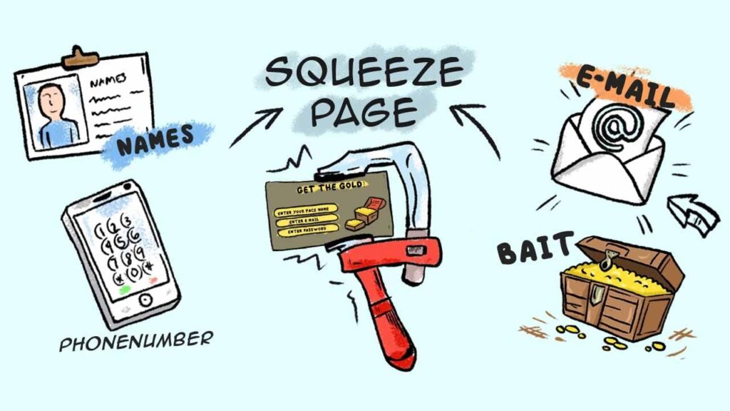
An opt-in page, also known as a squeeze page, is a web page that is designed to entice website visitors to provide their email address in exchange for something of value. This could be a free eBook, whitepaper, video tutorial, or another type of content. By creating an effective opt-in page for your business, you can increase the number of subscribers who are interested in your product or service!
In this article we will discuss everything you need to know about opt-in page:
- How to create an effective opt-in page that converts
- The Three key elements
- Why is it important to have opt-in page
- How can it help you grow your email list
- What software to use to create a opt-in page
- Examples of opt-in page
How to create an effective opt-in page that converts
When it comes to creating an effective opt-in page, there are a few key things to keep in mind. First and foremost, your opt-in page needs to be compelling and persuasive. It should highlight the benefits of subscribing to your email list, and explain how subscribing will help the reader achieve their goals.
Your opt-in form should also be easy to fill out, with minimal required fields. And finally, your page should be visually appealing and well-designed. If it looks professional and trustworthy, you’re more likely to convert visitors into subscribers.
The Three key elements
According to Clickfunnels there are 3 key elements to creating a good Squeeze page:
#1 Headline
- Grab the potential customer’s attention.
- Explain what the potential customer will get out of subscribing to your email list or downloading your lead magnet.
You might be familiar with the concepts of features and benefits:
- A feature is a quality or a feature of a product (e.g. “These shoes are waterproof!).
- A benefit is a benefit that the customer will derive from that product (e.g. “These shoes will keep your feet dry!”).
There’s a popular copywriter saying that goes like this:
It means that people buy on benefits, so whenever you are writing copy, you need to make sure that you are emphasizing the benefits, not the features.
You should think about your opt-in page as the sales page for either your email list or your lead magnet. How can you sell the potential customer on it?
It all starts with a benefit-driven headline. How will subscribing to your email list or downloading your lead magnet make their life better?
Figure it out and then emphasize it in your headline.
#2 Opt-in Form
The most basic opt-in form is one that only asks for the potential customer’s email address.
Of course, if you want to personalize your emails, you also need to ask them for their name.
You can ask for more information, such as their company name, job title, phone number, etc. This can help you generate qualified leads.
However, keep in mind that the more information you ask for, the less likely the potential customer will be to fill out that opt-in form.
Generally, a name and an email address are all you need if you are selling low-touch products, meaning ones that don’t require a salesperson to close the sale.
#3 Call to Action
You need to let the customer know what you want them to do next.
This is the purpose of call-to-action buttons. Note that the copy on them should be benefit-driven:
- Avoid copy like “Subscribe”, “Join”, “Get Updates”, etc.
- Use copy like “Get the Freebie”, “Send Me Deals”, etc.
Ask yourself:
What does the potential customer hope to get when they click that button? That’s what you should mention in its copy.
You may also want to experiment with the call-to-action button color. It can have a huge effect on the opt-in page conversion rate.
How to know if you have a good squeeze page or not
Here are some example
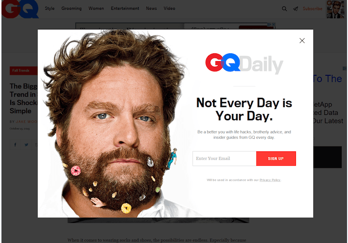
- The recognizable photo- serve as an authority badge of sorts.
- The ultra-short form – only ask for your desired information, email
- the call to action (CTA)- contrasts the white page well
- Why include a link that reads “No thanks, take me to MarketingSherpa” when there’s a “Close” button in the upper right-hand corner of the pop-up. You don’t want to make it any easier than it already is for users to click out of your squeeze page.
- The copy is redundant. When you combine the words in the red bar with those in the headline, you get everything that’s said in the content below it. Your headline and your sub-headline should complement each other, not say the same thing in differently sized fonts.
- The “About us” link has no place here. If the reader wants to learn more about your business, they’ll do so from your website’s main navigation bar. Helping them navigate there from this squeeze page does nothing but give them a way to escape.
- The CTA button copy should be written in the point of view of the reader, not of the writer.
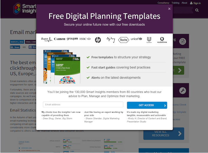
- The word “free” is the first thing you see on this squeeze page.
- Company badges associate Smart Insights with well-known brands like Unicef, Vodafone, HP, and Canon.
- Testimonials from real marketers boost trust. Though, it would be better if they had some pictures next to them.
- The short form only asks for email address, not even name or company.
- The bulleted copy quickly covers what you’ll receive by downloading the templates.
What to improve:
- The CTA is bad, bad, bad. “Get access”? Come on, now. There are many better phrases to use on your CTA.
- The offer is too vague. I realize I’ll get free templates, but what are they going to do for me? I’ll learn best practices for what? A strategy for what? I’ll get alerts on the latest developments regarding what? More specificity would help here.

What they did right:
- The copy is filled with persuasive words like “Exclusive,” “Secrets,” “Premium,” “Richer,” and “Free.”
- The button copy is written in first person.
- The content is short but informative. Users know exactly what they’re going to get when they enter their email address to download a copy.
- The button color isn’t bold or bright like the other squeeze pages we’ve already discussed. However, it contrasts the rest of the page. Contrast is always more important than color.
What to improve:
- Social share buttons should be on your “Thank You” page, or in the report itself, not on your squeeze page. People want to know your information is worth sharing before they do so with their networks.
- The 2014 copyright information is outdated. If this is, what else could be? Is the information in the report old news too?
So why is it important to have opt-in page for your business
An opt-in page allows you to collect the email addresses of people who are interested in what you have to say. This gives you the opportunity to contact them directly with updates, promotions, and other information that they may be interested in. It also helps you build a list of contacts that you can use for marketing purposes. When people sign up for your list, they are essentially giving you permission to contact them with whatever information or offers you choose. This makes it easier to reach your target audience and increase sales. An opt-in page is also a great way to build customer loyalty and create a positive impression of your business. People who sign
up for your list are more likely to do business with you in the future. Overall, an opt-in page is a valuable tool that can help you achieve your marketing goals.
How can it help you grow your email list or business
When you’re running a business, one of the most important things you can do is build an email list. This gives you a way to stay in touch with your customers and keep them up to date on your latest products and services.
But how do you go about building an email list? One of the best ways is to create an opt-in page. This is a special page on your website where people can sign up to receive your emails.
There are a few things you can do to make your opt-in page effective:
- Make it easy for people to sign up. Make sure there are clear buttons or links that allow people to subscribe quickly and easily.
- Use compelling language. Tell people what they’ll get by signing up, such as exclusive discounts, early access to new products, or monthly newsletters with tips and advice.
- Keep it simple. Don’t ask for too much information from potential subscribers; just ask for their name and email address.
- Use images. A well-designed opt-in page can be more effective in getting people to sign up. Use attractive images and design elements to make your page stand out.
An opt-in page is a great way to grow your email list, and by following these tips, you can create an effective page that will help you connect with more customers.