You have your business accounts on different platforms such as TikTok, Instagram, Google, YouTube, Twitter, Email, etc. You might be wondering what more can you do with the traffic that comes to your website or how to have more leads and sales. Well, you are in the right place to know all about what you need to know about landing pages!
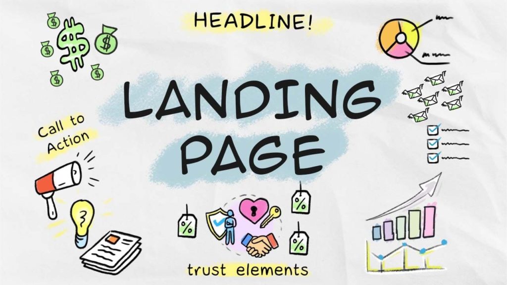
A landing page is a webpage where the main purpose is to make the visitors act. The only way out of a landing page is to either do the action or not. What sets landing pages apart from other web pages is that it has only one goal, persuading the visitors to make a move!
Landing pages are a juicy topic! Continues reading to know so much more about it Why is it important, and how to make, optimize and leverage it for your business!
What is a Landing Page?
A landing page is a standalone webpage with a clear call to action (CTA) (call to action). It is the location to which visitors are taken after clicking a link from many sources, like TikTok, Instagram, Facebook, Email, YouTube, etc.
Landing pages are created with a single emphasis or purpose, known as a call to action, as opposed to web pages, which often have multiple aims and encourage research.
Elements Of A Landing Page
The following are crucial elements of an efficient landing page:
-
Two Headlines: A Primary One And A Secondary One
The first thing visitors will notice on the landing page is the headline. It must explain exactly what a user will obtain from the website for this reason. The message must be compelling enough to draw the visitor in and keep them on your page. Your catchy headline ought to encourage comprehension, focus, and curiosity. What it must accomplish is capturing the audience’s attention, and describing the nature of your goods or service to the visitor. It should just be a few words long, ideally no more than ten, and never more than twenty.
Your headline can only say so much to make it brief and simple. You should also include a supporting headline because of this. This can be a direct continuation of the original headline, placed after it like a concluding sentence, or it can be another strong argument in support of the main one. This supporting headline or subheadline must persuade the reader.
If the visitor to your landing page is drawn in by your main headline, the enticing sub-title should persuade them to stay. The persuading subheadline typically follows the main headline and provides a little bit more depth and detail.
-
USP ( Unique Selling Proposition )
A unique selling proposition must be used to specify a point of differentiation. Tell the visitors to your landing page what makes your business or product stand out from the competitors. This should be succinctly stated on your landing page. Give clear examples of how your clients would benefit, and then describe your solution at its most fundamental level. A strong USP clarifies expectations for clients and enables them to understand why they should care.
-
The Advantages of Your Proposal
The unique selling proposition is promptly followed by the benefits of your offer, which give a more thorough explanation. You must be more specific with your offer and respond to any queries from clients, particularly those about the benefits of your service or product. Include a benefits summary list in bullet points for clarity, as well as a longer list of benefits and features that you can describe in more detail. The benefits identify the issue you are addressing, whereas the features describe what your product or service does.
-
Pictures or Videos
This serves as a visual representation of your offer and aids in visitors’ comprehension of both its nature and appearance. Giving examples rather than simply stating them has the greatest impact. Encourage your audience to see themselves in a situation and understand how they are using it. The use of images or motion pictures can help you do this.
If you decide to include images, make sure they are substantial, of excellent quality, and pertinent to your business or product. It is essential to include a product image on your landing page when selling a tangible item, especially. When you are marketing a service, the image should highlight its value and attract customers’ attention.
-
Social Proof
Social proof has enormous persuasive power. Utilizing social proof, you may show that others have purchased what you are selling. If visitors can see that others have already taken advantage of your offer, they are more likely to convert into customers. By including a tally of the number of signups, utilizing social signals from public networks, displaying awards from respected organizations, or including some customer testimonies and customer reviews, you can employ social proof on your landing page.
-
A Concluding Statement
As your landing page comes to an end, the concluding argument is your last opportunity to explain the value of your offer. Similar to the reinforcement statement, this supports your main value proposition. A call to action should be included with the concluding argument.
-
The CTA (call-to-action)
A call to action can be a single button on a click-through page or a section of a lead generation form. The call to action is a conversion-critical component, therefore its placement and design are crucial factors to take into account. The call to action ought to be enticing, thrilling, and convincing. Make it stand out by using colors that are in contrast. It may be found directly beneath an image or testimonials.
A landing page is a location where customers click and make purchases, generating cash for you. The aforementioned elements are necessary for creating a successful landing page. These components can be used to build an effective landing page with a high conversion rate. Once you’re done, it’s advised to always keep getting better. To achieve the greatest results, test your landing page and make the necessary changes.
Top 5 Free Landing Page Builder
-
Mailchimp
– One of the most effective email marketing platforms that enable the creation of landing pages and the deployment of email campaigns. Users can create simple landing pages with Mailchimp. enabling total amateurs to build a landing page and begin information gathering in a matter of minutes.
-
Hubspot
– You don’t need designers or IT assistance to create expert landing pages with HubSpot’s free landing page builder that draws in more visitors and turns them into qualified business leads.
-
Ucraft
– Create your unique landing pages using our free landing page generator and join the hundreds of brands, entrepreneurs, freelancers, and bloggers who are already using Ucraft for their advertising campaigns.
-
Wix
– The creation of landing pages that get results is simple with Wix. The process of creating a landing page for your campaign is easy and effective. Wix has a ton of templates that may be used to start building your landing page. You are not required to adhere to the original design because they are completely customizable.
-
WordPress
– From your WordPress dashboard, select SeedProd » Pages to start building your new landing page. From this point, you can configure several pages for your website, such as the login page, coming soon page, and others. Click the Create New Landing Page button after locating the section on landing pages by scrolling down.
How To Make A Landing Page
Here is a step-by-step guide to making your landing page using Wix:
- Sign Up or Log In to your Wix account
- Choose a template for a landing page.
- Click “Edit”.
- Choose a name for your landing page.
- Insert your original content in the template.
- Include powerful visuals.
- Select an appropriate domain name.
- Verify that all of your links and Call-To-Actions are active.
- Complete your title and meta description.
- Finally, click “Publish” when done editing the template according to your liking.
Edit according to all the things mentioned above earlier, apply those tips and techniques and you will surely be able to make an excellent landing page!
Optimizing Your Landing Page For Conversion
By optimizing a landing page, you can ensure that the visitors that view it convert at the maximum rate feasible. Here are the things you need to do to optimize your landing page for conversion.
Clarify Your Offer
Consider the precise objective of your target audience before creating a headline. What do you offer?
A discount?
Free Subscription?
Free Trial?
The First 100 get a buy 1 take one promo.
Whatever your offer make sure that it is stated clearly on your landing page. Never confuse, always make it clear and straight to the point.
Make Your Landing Page Simpler
Although it may seem paradoxical, a very straightforward landing page eliminates visual clutter. Your call to action is the prize you want website visitors to concentrate on.
Dropbox is an example. The business makes fantastic landing pages that say a lot in a few words.
Try to make your landing page as simple as possible but also as full as you can. Everything they might need, but not bombard them with details ( because that is the Homepage’s purpose ).
Try Using Contrasting Hues
The contrast in color and clarity has been used to great effect on the best landing pages existing. The CTA in this Starbucks example is impossible to ignore.
Although the color of the star on the left-side emblem is reflected in the “Join Now” button, it is much more distinct and obvious. The headline and CTA stand out against the textured black background. Additionally, there is a lot of space between the logo and the other components.
Contrasts drive attention and make people have second look which then leads to making them interested.
Keep the Crucial Information Above the Fold
To encourage readers to buy the paper after seeing the headlines, the most alluring stories were published on the front page, above the standard newspaper fold.
Keep your landing page items above the digital fold, which is the point at which a user must scroll to see more information. This is more challenging than ever now that more people are using smartphones and tablets, but you can get the same result.
The good news is that you can maintain your headline, a few sentences of body copy, and a CTA front and center while using a scroll map to quickly determine where the average fold appears on various screens.
Use Strategies for Scarcity
“Limited time” and “limited stocks” are among the most popular marketing catchphrases for a reason. Visitors to your landing page are compelled to act immediately by the sense of scarcity because they fear missing out if they wait.
Even large-scale retailers employ it.
Your call-to-action Buttons Should be Simple
A call-to-action button shouldn’t make the reader anxious or perplexed. Make your offer simple, direct, and understandable.
The following words are examples of a good call-to-action button:
- Sign up to Download
- Obtain Dropbox Business for Free.
- Join Today
- Choose Here
Simple, yes? And very successful.
Include Your Contact Details
There are many various methods you can give your website visitors your contact information. Your landing page can include your phone number, email address, or contact form. Links to other companies’ support pages are also provided, such as Shopify.
Customers are already aware that help centers contain contact information, responses to commonly asked issues, and tutorials. Be sure to add yours and respond as soon as you can. It is counted as excellent customer service whether the visitor is part of the clientele, about to make a purchase, or purely just inquiring.
Include Endorsements to Help Sway Hesitant Users
Social proofs are very important.
One of the finest methods to do this is through testimonials. You will have an advantage over the competition if you can persuade your clients to record a video testimonial. As long as you provide the customer’s full name and, ideally, a picture, quotes also perform nicely.
Make sure to get their consent when you do this because some clients don’t want exposure and you have to respect it.
Mobile-friendly design
Considering that research shows that 56.89% of all internet traffic worldwide occurs on mobile devices, developing landing pages for mobile use is crucial.
A landing page that has been optimized for mobile devices changes its layout. In addition to ensuring accurate presentation on smaller displays, it also greatly eases site navigation. It reformats the content, enlarges the navigation buttons, and scales graphics for different screen sizes.
Difference Between Landing Page and Home Page
What separates the landing page from any other page is its purpose, and that is to make the visitors act. An optimized landing page will help your business generate more leads and increase sales.
A landing page is targeted and specific, in contrast to your homepage, which is general. The homepage of your website entices visitors to stay longer by listing every choice your company provides, whereas a landing page only contains one direct call to action.
The truth is that, while increasing traffic to your home page is unquestionably a good thing, it is less likely than landing pages to lead to conversions. Users are encouraged to travel to a variety of various destinations from home pages, which offer a wealth of information. If a visitor arrives at your homepage with a specific objective in mind, having to first browse through several other services and product possibilities may turn them away. The primary goal of the homepage is to point visitors to other pages where they can get the information they need.
Landing pages embody focus and are a straight arrow for the call to action for the visitors!
Why do I Need a Landing Page?
Landing Pages Convert More Traffic
Landing pages increase traffic conversion since they are focused on a single goal or call to action by providing information about a certain offer or item. Its straightforward layout and minimal navigation prevent users from becoming lost in a sea of links that lead away from the page’s main objective. When an effective advertisement showcases a particular deal, a dedicated landing page acts as the destination for traffic and increases the possibility that visitors will convert to purchasers.
They Boost Online Search Activity
A landing page that is optimized for search engines employs targeted keywords, and adheres to best practices for SEO will increase organic traffic to your website.
Don’t relax too much, though, after you’re happy with the content of your landing page. It’s wise to regularly evaluate the effectiveness of your pages, look for any potential execution flaws, and adjust the content of your landing pages as necessary.
Perhaps you need to update your messaging to reflect recent changes in your business, or perhaps a recent Google algorithm update has changed the focus of the search ranking factors. The chase for success in the field of digital marketing never ends.
They Produce Leads and Sales
Without a doubt, landing pages that combine attractive downloading assets with form fills assist in generating more quality leads and produce greater conversion rates. Dedicated pages for downloads are a clever method to track down your most potential sales prospects.
Any type of useful content that is gated by a form and accessible only after submitting the form is referred to as a lead magnet. They become a lead even if they merely give their name and email. Create a landing page just for the lead magnet with an emphasis on the content, the form, and the keywords.
Different consumer types can be targeted with customized landing pages. Its influence on the intended client group will be determined by its content, page style, advertising, and offer. The goal of landing pages can be to attract customers from a certain area, demographic, or those who are considering price and quality.
Types of Landing Pages You Can Use
Lead Generation Landing Page
A lead-generation or lead-capture landing page’s primary objective is to collect leads using a data capture form. These pages can be used in a variety of ways, but they are most typically used in the middle of the sales funnel while customers are still debating whether to accept your offers or not. It asks for something while yet promising something in return. The reward, which is the specific offer you are advertising to generate leads, is the data you want in your form. The request and the reward should be equally spaced out. For a customer to give you their information and sign up for your mailing list, the good or service you are promoting must be worthwhile.
Click-through Landing Page
A click-through page does not need a form at all, in contrast to the lead-generation page, which depends on one. It serves as a straightforward intermediary between your advertisement and the page you want to finally drive customers to. For instance, it is frequently used to link an advertisement to a shopping basket. It merely needs a clear, obvious call to action. With a link to the destination and a brief explanation of what the visitor has discovered by clicking through.
Squeeze Landing
A squeeze page is used to gather information, much like a lead-generation page. It is typically used near the top of the sales funnel, unlike a lead-generation page, and its main objective is to collect email addresses to add potential leads to a general mailing list. They have brief, straightforward landing pages with strong headlines, etc. The reader will know exactly what to expect from the click-through, thanks to a clear call to action. In addition to the brief form, there should be a link that directs the reader to the following step as well as a button that allows them to leave if they choose not to.
Sales Landing Page
The most difficult part of website design is typically the sales page. Using the information on this website, you are no longer limited to lead prospecting. It would be utilized in the bottom of the funnel and would need to convince customers to make a purchase, which is a completely different objective than a basic request and incentive plan. The creation of the page, from the language to the design, requires a certain amount of tact and a deep understanding of your client’s wants and where they are in the sales process. You run the risk of either overcharging and losing the client or undercharging and maintaining them at this point. Your design and communication tactics must incorporate some traditional salesmanship at this point.
The length of the page largely depends on your product and how much you need to mention to convey to your audience why it is valuable. Whatever the duration, there must be a thorough pitch that simply conveys this value to persuade the audience to click the button and make the buy.
Splash Landing Page
Splash pages are perhaps the most straightforward kind of landing page and may be utilized at any stage of your sales funnel. They often contain just a few words of prose, one or two bold graphics, and extremely basic language—usually an announcement or a straightforward “yes” or “no” request. Before accessing your website, they might require your reader to confirm their age or select their preferred language. They merely serve to give your visitors extremely basic information. Before they join your website and are not intended to collect data or generate leads.
Kinds of Landing Pages According to Traffic
Cold Traffic
A group of people known as “cold traffic” is those who have never heard of or engaged with your business before. These consumers just click on your advertising because they are interested in what you are marketing, not because they have heard of your brand or know what it stands for.
The content for a landing page for cold traffic should be more on introduction, and this type of landing page should never sell anything, or if they do it should be very cheap so that no intimidation will occur since they barely know the business.
Warm Traffic
Warm traffic is those that are halfway between cold and hot. Even though they haven’t quite completed the customer journey, they are still important. Even if a sales lead is still in the warm stage and not quite ready to buy, you presumably still have some level of trust and relationship with them.
This type of lead is someone who knows about your business but hasn’t made a purchase or transaction yet. This landing page can start to offer deals or products but never more than worth 250 dollars. This is more like a test before availing the big order or transaction to see how your service or products goes.
Hot Traffic
A qualified lead is called a “hot lead”. If they are interested in your goods and are prepared to make a direct sales pitch.
A hot lead can be a previous customer or someone who is exactly looking for the services your business provides. They know about your company and will surely avail the services you offer.
You should make your landing pages optimized according to these types of leads! This is very important. This will be your key to converting many visitors!
How Many Landing Pages Do I Need?
Business websites with 10 to 15 landing pages would see a 55% increase in conversions, according to studies. Additionally, websites with more than 40 landing pages saw a 500% increase in conversions. There is no set number of landing pages you should have. And one won’t be able to serve your complete target market.
So if 40 is the standard and it does good, why not do more so you could better? Have more than 40 landing pages! Make the most out of these conversions, make more cash, and have more leads!


